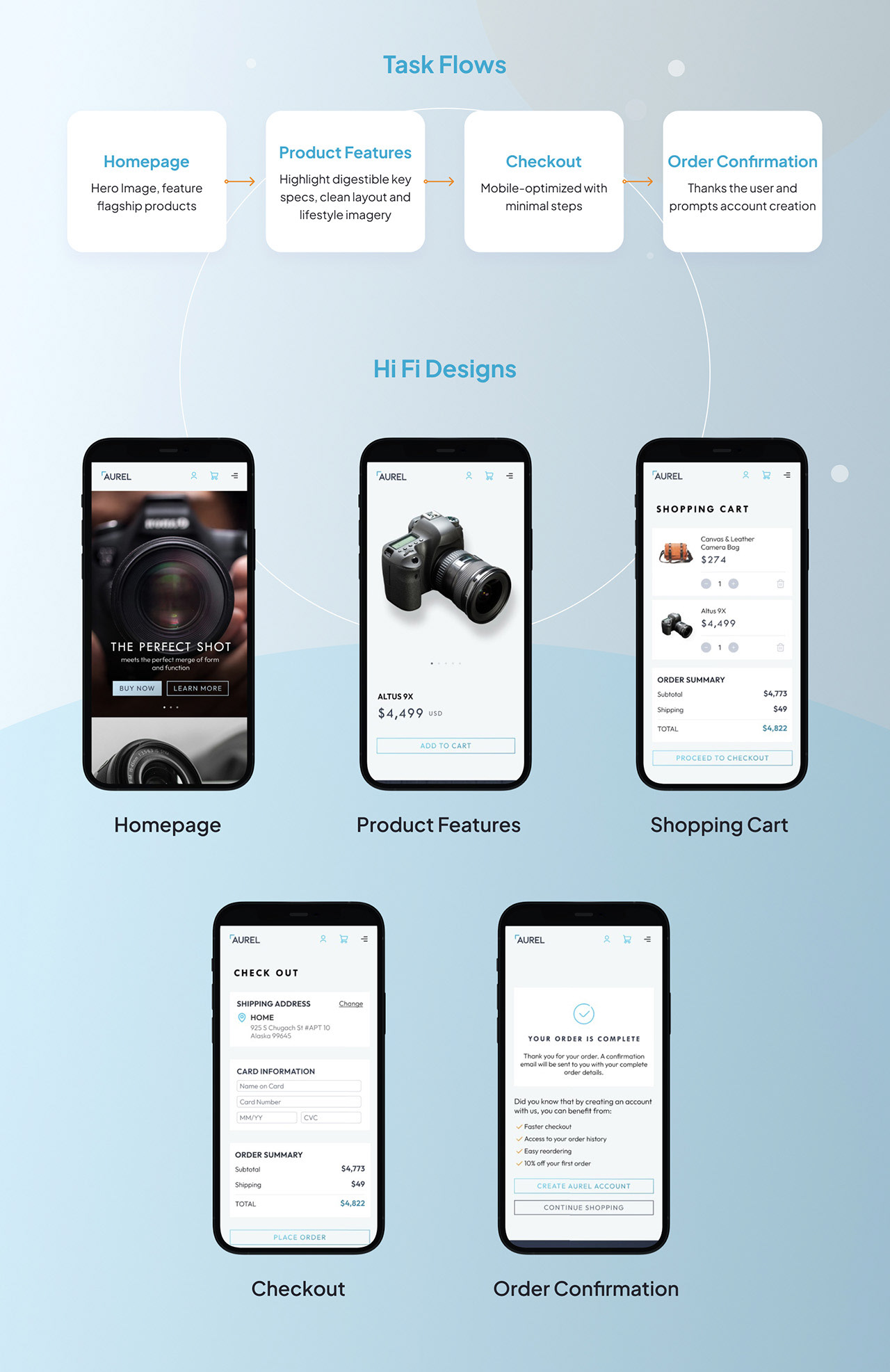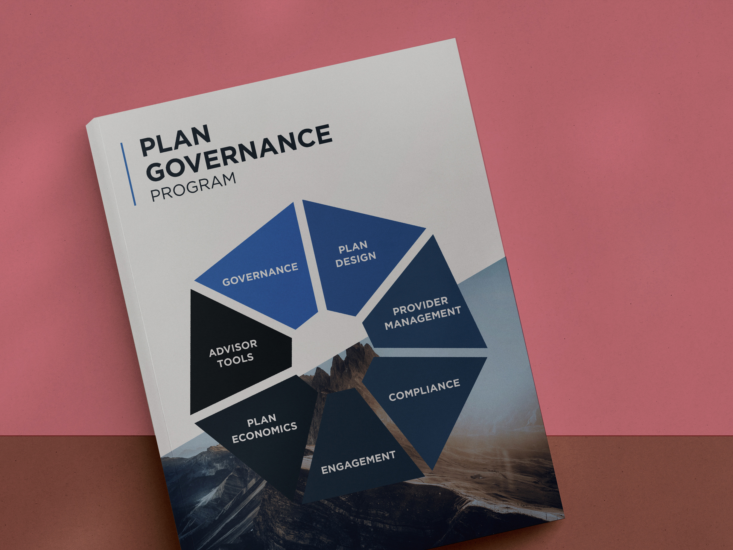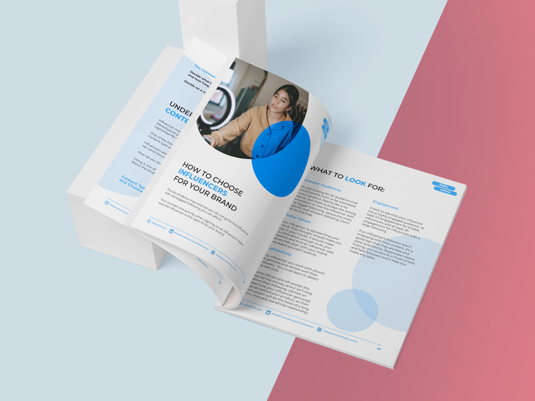
Tasked with designing a premium mobile shopping experience for Aurel, a high-end DSLR brand, I focused on a common challenge: balancing luxury visual appeal with fast, intuitive usability. I started by mapping the customer journey to identify friction points, particularly during product comparison and checkout. Users wanted to explore features in detail without feeling overwhelmed or lost in technical jargon. To support that, I prioritized clean hierarchy, progressive disclosure of information, and a modular layout system that could scale across product lines.
Each screen was designed with intent: the landing page drew focus to brand storytelling and featured visuals, while the cart interaction emphasized ease of use and reduced cognitive load through thoughtful defaults and microinteractions. I prototyped transitions to mimic natural shopping behaviors, making sure animations enhanced clarity rather than distract. Throughout the process, I weighed visual richness against performance demands on mobile and adjusted accordingly, ensuring the experience felt both high-end and efficient.
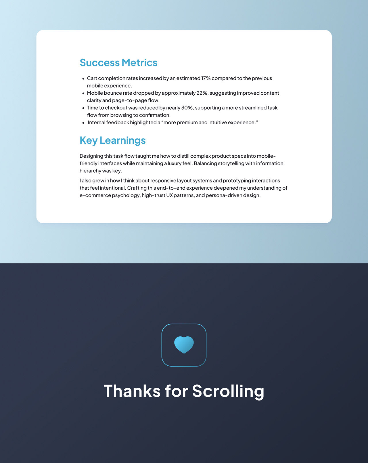
Impact: Improved flow clarity and alignment with user expectations, positioning the product as both aspirational and functional, enhancing purchase confidence and reducing friction in the mobile buying experience.