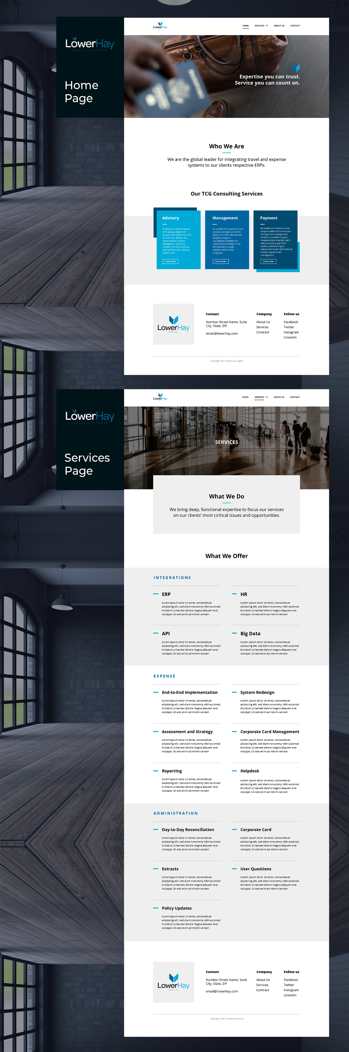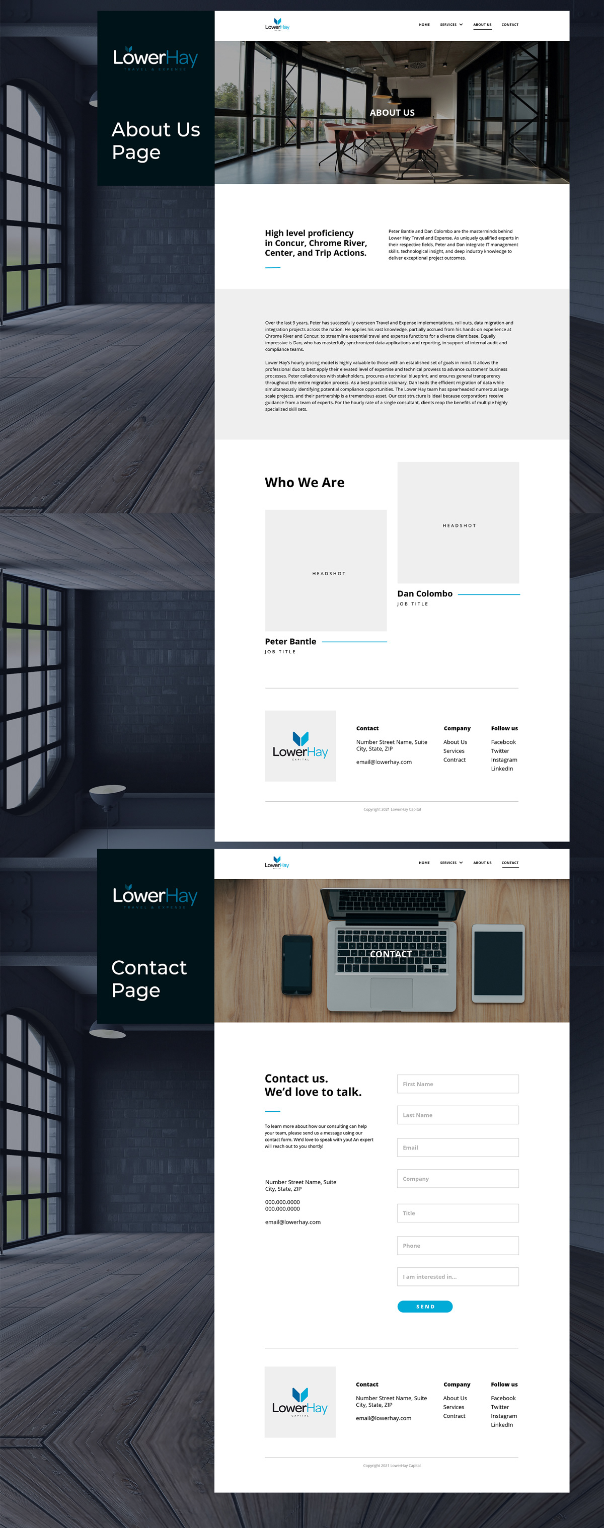
Contributed front-end design to the upcoming website for LowerHay Travel & Expense, focusing on clear layout, intuitive content grouping, and user-centric simplicity. Designed for first-time users unfamiliar with travel management tools, the structure emphasized scannability, accessible type, and minimal friction. This project reinforced the power of UX fundamentals—hierarchy, spacing, and clarity—to support comprehension even in lightweight experiences.
Impact: Designed to reduce bounce rate and increase first-task completion for new users; anticipated to improve time-on-page by 20–30% based on usability heuristics.